ShopDreamUp AI ArtDreamUp
Deviation Actions


Suggested Deviants


Suggested Collections


You Might Like…


![[FULL COMMISSION] - LETs GET TO IT](https://images-wixmp-ed30a86b8c4ca887773594c2.wixmp.com/f/afb17d34-4949-452c-a0af-4fe910c9e89c/d79xk5q-e8356672-c49e-416a-a5c3-453334172890.png/v1/crop/w_184,h_184,x_0,y_14,scl_0.18604651162791,q_70,strp/_full_commission____lets_get_to_it_by_lilchu_d79xk5q-92s-2x.jpg?token=eyJ0eXAiOiJKV1QiLCJhbGciOiJIUzI1NiJ9.eyJzdWIiOiJ1cm46YXBwOjdlMGQxODg5ODIyNjQzNzNhNWYwZDQxNWVhMGQyNmUwIiwiaXNzIjoidXJuOmFwcDo3ZTBkMTg4OTgyMjY0MzczYTVmMGQ0MTVlYTBkMjZlMCIsIm9iaiI6W1t7ImhlaWdodCI6Ijw9MTI4MCIsInBhdGgiOiJcL2ZcL2FmYjE3ZDM0LTQ5NDktNDUyYy1hMGFmLTRmZTkxMGM5ZTg5Y1wvZDc5eGs1cS1lODM1NjY3Mi1jNDllLTQxNmEtYTVjMy00NTMzMzQxNzI4OTAucG5nIiwid2lkdGgiOiI8PTk4OSJ9XV0sImF1ZCI6WyJ1cm46c2VydmljZTppbWFnZS5vcGVyYXRpb25zIl19.M9GTkCBPx3R-Lw4HBH_CWIJMFac5GId8KpBaXuJmW04)
![[FULL COMMISSION] - LETs GET TO IT](https://images-wixmp-ed30a86b8c4ca887773594c2.wixmp.com/f/afb17d34-4949-452c-a0af-4fe910c9e89c/d79xk5q-e8356672-c49e-416a-a5c3-453334172890.png/v1/crop/w_92,h_92,x_0,y_7,scl_0.093023255813953,q_70,strp/_full_commission____lets_get_to_it_by_lilchu_d79xk5q-92s.jpg?token=eyJ0eXAiOiJKV1QiLCJhbGciOiJIUzI1NiJ9.eyJzdWIiOiJ1cm46YXBwOjdlMGQxODg5ODIyNjQzNzNhNWYwZDQxNWVhMGQyNmUwIiwiaXNzIjoidXJuOmFwcDo3ZTBkMTg4OTgyMjY0MzczYTVmMGQ0MTVlYTBkMjZlMCIsIm9iaiI6W1t7ImhlaWdodCI6Ijw9MTI4MCIsInBhdGgiOiJcL2ZcL2FmYjE3ZDM0LTQ5NDktNDUyYy1hMGFmLTRmZTkxMGM5ZTg5Y1wvZDc5eGs1cS1lODM1NjY3Mi1jNDllLTQxNmEtYTVjMy00NTMzMzQxNzI4OTAucG5nIiwid2lkdGgiOiI8PTk4OSJ9XV0sImF1ZCI6WyJ1cm46c2VydmljZTppbWFnZS5vcGVyYXRpb25zIl19.M9GTkCBPx3R-Lw4HBH_CWIJMFac5GId8KpBaXuJmW04)
Featured in Groups


Description
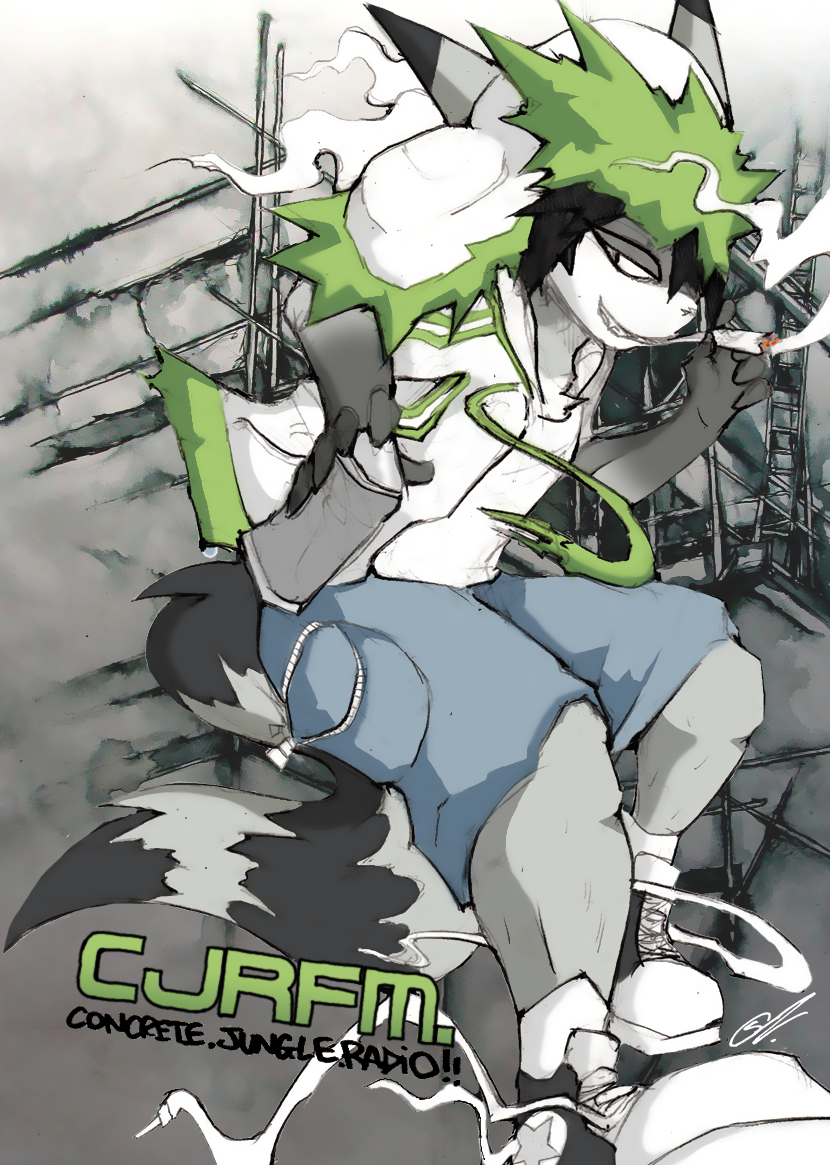
Spliff the Raccoon © TEAM HAPPI BOMB // CJRFM
Time for some seriously gangsta sheeitt!
possibly the coolest (if not best) pic in my entire gallery period! Took a while but I love the final result! ^w^
Workings:
:thumb271618484: :thumb273828794:
Background:
:thumb205318984:
Comments, faves and crits are very very very very very very very very very very very very very very very much appreciated!!
Time for some seriously gangsta sheeitt!
possibly the coolest (if not best) pic in my entire gallery period!
Workings:
:thumb271618484: :thumb273828794:
Background:
:thumb205318984:
Comments, faves and crits are very very very very very very very very very very very very very very very much appreciated!!
Image size
830x1165px 1.19 MB
© 2011 - 2024 SmokyJai
Comments93
Join the community to add your comment. Already a deviant? Log In
When it comes down to pure badassery, Spliff the racoon is doing it right. His attitude is very devil-may-care, his outfit is flashy and his laces are always untied but never seem to trip him up.
The composition for this picture is excellent, drawing the viewer's eye back to the center constantly no matter where you look. Look at the shoes, you travel up the leg to the can of spray paint, and then up his arm into the wacked out fur adorning the shoulder and hood of his jacket, meandering up to his right ear; but right when you're ready to stop looking, the left ear draws you back down to the hood and you take a detour along the smoke which brings you to the cigarette and Spliff's irresistably cheeky grin. Every time you try to leave your eye is drawn back to the center, and that, for me is one of the best things about it.
Then we have the gritty, urban feel of New London residing in the background, which once again draws us back to Spliff, be it through the scaffolding or the scratches in the concrete. And let's not forget the color scheme, which once again throws Spliff to the forefront by contrast, but not obnoxiously so.
Finally we have the CJRFM logo in the bottom left corner, adding impact and a nice little green amidst a sea of duller hues, but again, it does not stick out like a sore thumb, which is great.
Overall, the illustration was masterfully created and wonderful to look at. I hope this evaluation is fair.